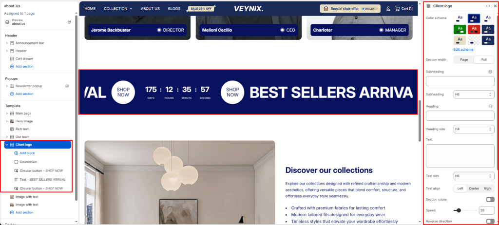
The Client Logo section displays a row of partner, client, or “as seen in” press logos to build trust and social proof. Logos can be arranged in a static grid or an auto-scrolling strip.
Section Settings #
Color scheme #
Choose a predefined color scheme to control the section’s background, text, and accent colors, keeping it consistent with the rest of the theme design.
Section width #
Control how wide the section appears on the page.
Options:
- Page
- Full
Subheading #
A short label or eyebrow text displayed above the main heading.
Subheading size #
Control the font size of the subheading.
Options:
- H1
- H2
- H3
- H4
- H5
- H6
Heading #
The main heading text for this section.
Heading size #
Control the font size of the heading.
Options:
- H1
- H2
- H3
- H4
- H5
- H6
Text #
The body/description text for this section.
Text size #
Control the font size of the body text.
Options:
- H1
- H2
- H3
- H4
- H5
- H6
Text align #
Control the horizontal text alignment of the section content.
Options:
- Left
- Center
- Right
Section rotate #
Toggle this feature on or off.
Speed #
Use the slider to fine-tune this value numerically.
Reverse direction #
Reverse the scroll direction of the marquee (left-to-right instead of right-to-left).
Logo max height #
Use the slider to fine-tune this value numerically.
Top padding #
Add vertical spacing above the section content for better layout balance with the section above it.
Bottom padding #
Add vertical spacing below the section content for better layout balance with the section below it.
Section Blocks #
Text block #
- Text — The body/description text for this section.
- Text size — Control the font size of the body text.
Image block #
- Image — Upload the image to display for this block/section.
- Link — Set the destination link — this can point to a product, collection, page, blog article, or external URL.
Pill block #
- Text — The body/description text for this section.
- Link — Set the destination link — this can point to a product, collection, page, blog article, or external URL.
- Icon image — Choose the icon displayed for this element.
- Gradient start — Choose a specific color for this element.
- Gradient end — Choose a specific color for this element.
- Text color — Choose a specific color for this element.
Countdown block #
- Expiration date — Enter the text content to display.
- Text size — Control the font size of the body text.
Circular button block #
- Button label — The body/description text for this section.
- Button link — Set the destination link — this can point to a product, collection, page, blog article, or external URL.
- Background color — Choose a specific color for this element.
- Text color — Choose a specific color for this element.


