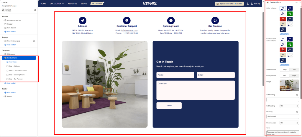
The Contact Form section renders a customer contact form (name, email, phone, message) that submits directly to the store’s contact notification email, along with optional supporting content such as an address, map, or image.
Section Settings #
Color scheme #
Choose a predefined color scheme to control the section’s background, text, and accent colors, keeping it consistent with the rest of the theme design.
Contact form color scheme #
Choose a color scheme to apply to this element, keeping it consistent with the rest of the theme design.
Section width #
Control how wide the section appears on the page.
Options:
- Page
- Full
Form position #
Choose one of the available options from the dropdown.
Options:
- Left
- Right
Image #
Upload the image to display for this block/section.
Subheading #
A short label or eyebrow text displayed above the main heading.
Subheading size #
Control the font size of the subheading.
Options:
- H1
- H2
- H3
- H4
- H5
- H6
Heading #
The main heading text for this section.
Heading size #
Control the font size of the heading.
Options:
- H1
- H2
- H3
- H4
- H5
- H6
Text #
The body/description text for this section.
Text size #
Control the font size of the body text.
Options:
- H1
- H2
- H3
- H4
- H5
- H6
Text align #
Control the horizontal text alignment of the section content.
Options:
- Left
- Center
- Right
Button style #
Choose the visual style of the button.
Options:
- Primary button
- Secondary button
Top padding #
Add vertical spacing above the section content for better layout balance with the section above it.
Bottom padding #
Add vertical spacing below the section content for better layout balance with the section below it.
Section Blocks #
Info block #
- Icon — Choose the icon displayed for this element.
- Icon — Choose the icon displayed for this element.
- Heading — The main heading text for this section.
- Text — The body/description text for this section.
Custom field block #
- Field type — Choose one of the available options from the dropdown.
- Label — Enter the text content to display.
- Placeholder — Enter the text content to display.
- Options (for select or radio) — Enter the text content to display. Supports multiple lines.
- Required — Toggle this feature on or off.
- Full width — Toggle this feature on or off.


