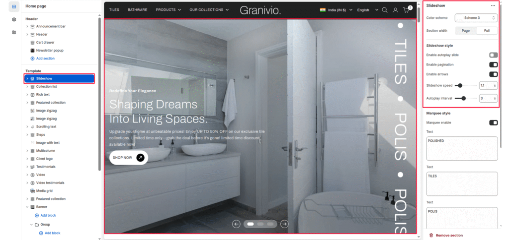
The Slideshow section displays large visual slides with images, text overlays, and call-to-action buttons. It is commonly used as a hero section on the homepage to highlight promotions or collections.
Color Scheme #
Controls the color palette used for text, buttons, and overlays inside the slideshow.
Section width #
Control how wide the banner appears:
- Page: Keeps the banner within the page container width.
- Full: Spans edge-to-edge across the browser window for a full-width.
Slideshow Style #
Manages the behavior and interaction of the slides, including autoplay, navigation, and animation speed.
Enable Autoplay Slide #
Automatically transitions between slides without user interaction.
Enable Pagination #
Displays pagination indicators (dots) to show the current slide position.
Enable Arrows #
Shows navigation arrows to manually switch between slides.
Slideshow Speed #
Controls the animation speed when transitioning from one slide to another.
Autoplay Interval #
Sets the delay time between automatic slide transitions.
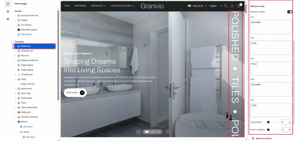
Top padding / Bottom padding #
Add vertical spacing above and below the banner content for better layout balance.
Slide Content (Group Block) #
Each slide can contain a Group block that holds headings, text, and buttons, allowing structured and flexible content layout.
Marquee Style #
Adds a vertically scrolling or static decorative text element, usually displayed along the side of the slideshow.
Marquee Enable #
Turns the marquee text feature on or off.
Marquee Text Fields #
Allows multiple text entries that appear sequentially in the marquee display.


