Skip to content
Villyit
Villyit
  • Contact
  • Theme Support

getting Starting

1
  • Getting Started

general settings

12
  • Additional Features
  • Cart
  • Product
  • Search
  • Badges
  • Currency codes
  • Social Media
  • Layout
  • Typography
  • Colors
  • Breadcrumbs
  • Logo

header

3
  • Cart drawer
  • Header
  • Announcement bar

sections

34
  • Gallery
  • Logo List
  • Scrolling text
  • Image card
  • Video
  • Image Zigzag
  • Video Testimonials
  • Media grid
  • Highlight testimonial
  • Product bundle
  • Visual story
  • Highlight text with image
  • Testimonials
  • Steps
  • Slideshow
  • Shop the look
  • Rich Text
  • Our team
  • Newsletter
  • Multicolumn
  • Image with Text
  • Image gallery
  • Hero image
  • Hero floating showcase
  • Features with images
  • Featured Collection
  • FAQ
  • Contact Form
  • Collection highlights
  • client logo
  • Category showcase
  • Cart drawer
  • before after image
  • Banner

footer

1
  • Footer

blogs and articles

4
  • Related Post
  • Main Blog
  • Blog Post
  • Article

collections

4
  • Main Collection List
  • Main Collection Banner
  • Main Collection
  • Collection List

product

5
  • Related Products
  • Recently viewed products
  • Featured product
  • Product recommendations
  • Main Product

blocks

15
  • Blocks
  • Heading
  • Text
  • Subheading
  • Slide
  • Rich text
  • Rating
  • Product block
  • Buttons
  • Image
  • Group
  • Countdown
  • Column
  • Circular text badge
  • Breadcrumbs

Popups

1
  • Newsletter Popup
View Categories
  • Home
  • Helpdesk
  • Veynix
  • sections
  • Banner

Banner

2 min read

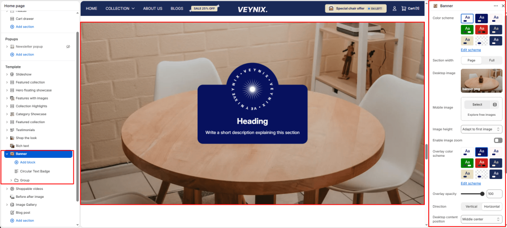
The Banner section is a visually impactful area designed to display a large background image (or video) with optional text overlay content. It’s commonly used on landing pages such as About Us, Collections, or Home, to introduce the page with strong visuals and key messaging.

Section Settings #

Color scheme #

Choose a predefined color scheme to control the section’s background, text, and accent colors, keeping it consistent with the rest of the theme design.

Section width #

Control how wide the section appears on the page.

Options:

  • Page
  • Full

Desktop image #

Upload a high-quality image optimized for larger screens.

Mobile image #

Optionally upload a separate image optimized for mobile devices to ensure visual clarity and proper scaling on smaller screens.

Image height #

Choose one of the available options from the dropdown.

Options:

  • Adapt to first image
  • Small
  • Medium
  • Large
  • Full screen

Enable image zoom #

Toggle this feature on or off.

Overlay color scheme #

Choose a color scheme to use for the overlay layer that sits on top of the background image or video.

Overlay opacity #

Adjust the transparency of the overlay layer on top of the background media. Increasing this improves text readability and contrast against busy images.

Direction #

Choose how the content elements are arranged.

Options:

  • Vertical
  • Horizontal

Desktop content position #

Defines where the overlay content is anchored within the section on desktop screens.

Options:

  • Top left
  • Top center
  • Top right
  • Middle left
  • Middle center
  • Middle right
  • Bottom left
  • Bottom center
  • Bottom right

Top padding #

Add vertical spacing above the section content for better layout balance with the section above it.

Bottom padding #

Add vertical spacing below the section content for better layout balance with the section below it.

This section also accepts global theme content blocks and/or Shopify app blocks (@theme, @app), letting merchants freely add heading, text, image, button, and app-provided blocks inside it.

Updated on July 3, 2026

What are your Feelings

  • Happy
  • Normal
  • Sad
Share This Article :
  • Facebook
  • X
  • LinkedIn
  • Pinterest
Table of Contents
  • Section Settings
    • Color scheme
    • Section width
    • Desktop image
    • Mobile image
    • Image height
    • Enable image zoom
    • Overlay color scheme
    • Overlay opacity
    • Direction
    • Desktop content position
    • Top padding
    • Bottom padding
© 2025 Villyit . All Rights Reserved.