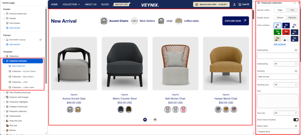
The Featured Collection section showcases products from a single chosen collection in a responsive grid or slider, complete with quick-add, pricing, and “view all” navigation.
Section Settings #
Section width #
Control how wide the section appears on the page.
Options:
- Page
- Full
Design layout #
Choose the layout arrangement used to display this section’s content.
Options:
- Default
- Editorial
Color scheme #
Choose a predefined color scheme to control the section’s background, text, and accent colors, keeping it consistent with the rest of the theme design.
Editorial layout color scheme #
Choose a color scheme to apply to this element, keeping it consistent with the rest of the theme design.
Editorial vertical text #
Enter the text content to display.
Subheading #
A short label or eyebrow text displayed above the main heading.
Subheading size #
Control the font size of the subheading.
Options:
- H1
- H2
- H3
- H4
- H5
- H6
Heading #
The main heading text for this section.
Heading size #
Control the font size of the heading.
Options:
- H1
- H2
- H3
- H4
- H5
- H6
Text #
The body/description text for this section.
Text size #
Control the font size of the body text.
Options:
- H1
- H2
- H3
- H4
- H5
- H6
Show View all button #
Toggle this feature on or off.
Button label #
Enter the text content to display.
Button style #
Choose the visual style of the button.
Options:
- Primary button
- Secondary button
Show second image on hover #
Toggle this feature on or off.
Desktop view #
Choose one of the available options from the dropdown.
Options:
- Grid
- Slideshow
Show add to cart button #
Toggle this feature on or off.
Show product vendor #
Toggle this feature on or off.
Show product rating #
Toggle this feature on or off.
Show variant swatches #
Toggle this feature on or off.
Enable mobile slideshow for grid view #
Toggle this feature on or off. On mobile, grid view will become a horizontal slideshow
Products to show #
Use the slider to fine-tune this value numerically.
Products per row on desktop #
Set how many products are displayed per row.
Products per row on mobile #
Set how many products are displayed per row.
Top padding #
Add vertical spacing above the section content for better layout balance with the section above it.
Bottom padding #
Add vertical spacing below the section content for better layout balance with the section below it.
Autoplay slideshow #
Enable to automatically rotate through slides without requiring the customer to click.
Speed (ms) #
Control how many seconds each slide is shown before automatically advancing (only applies when autoplay is enabled).
Show navigation #
Control the visibility of navigation arrows/dots.
Show scrollbar #
Toggle this feature on or off.
Pagination style #
Choose one of the available options from the dropdown.
Options:
- Dots
- Progress bar
- Numbers line
- Circle progress
Section Blocks #
Collection block #
- Tab label — Enter the text content to display.
- Collection — Select the collection this section should pull products from.
- Tab image — Upload an image to use for this element.


