Skip to content
Villyit
Villyit
  • Contact
  • Theme Support

getting Starting

1
  • Getting Started

general settings

12
  • Additional Features
  • Cart
  • Product
  • Search
  • Badges
  • Currency codes
  • Social Media
  • Layout
  • Typography
  • Colors
  • Breadcrumbs
  • Logo

header

3
  • Cart drawer
  • Header
  • Announcement bar

sections

34
  • Gallery
  • Logo List
  • Scrolling text
  • Testimonials
  • Image card
  • Video
  • Image Zigzag
  • Video Testimonials
  • Media grid
  • Highlight testimonial
  • Product bundle
  • Visual story
  • Highlight text with image
  • Steps
  • Slideshow
  • Shop the look
  • Rich Text
  • Our team
  • Newsletter
  • Multicolumn
  • Image with Text
  • Image gallery
  • Hero image
  • Hero floating showcase
  • Features with images
  • Featured Collection
  • FAQ
  • Contact Form
  • Collection highlights
  • client logo
  • Category showcase
  • Cart drawer
  • before after image
  • Banner

footer

1
  • Footer

blogs and articles

4
  • Related Post
  • Main Blog
  • Blog Post
  • Article

collections

4
  • Main Collection List
  • Main Collection Banner
  • Main Collection
  • Collection List

product

5
  • Related Products
  • Recently viewed products
  • Featured product
  • Product recommendations
  • Main Product

blocks

15
  • Blocks
  • Heading
  • Text
  • Subheading
  • Slide
  • Rich text
  • Rating
  • Product block
  • Buttons
  • Image
  • Group
  • Countdown
  • Column
  • Circular text badge
  • Breadcrumbs

Popups

1
  • Newsletter Popup
View Categories
  • Home
  • Helpdesk
  • Veynix
  • sections
  • FAQ

FAQ

2 min read

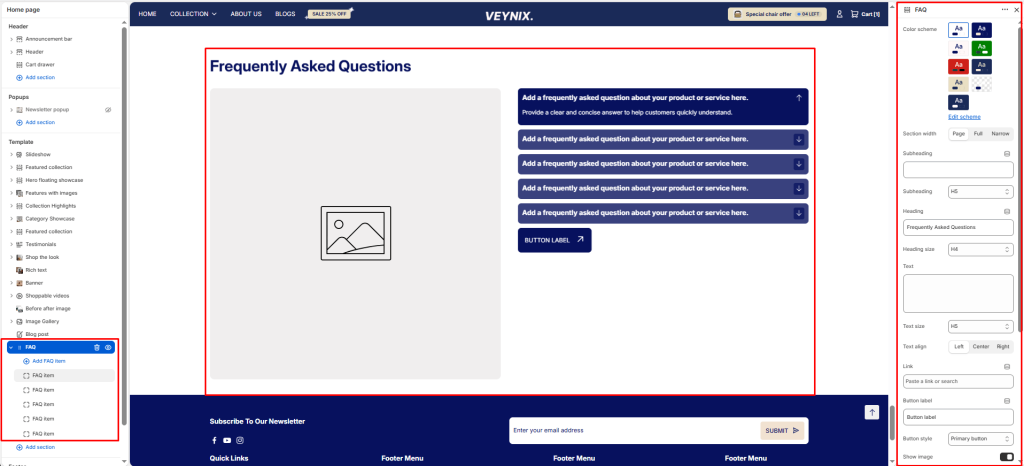
The FAQ section displays a list of frequently asked questions in an expandable accordion format, reducing pre-purchase support requests and improving on-page SEO through structured Q&A content.

Section Settings #

Color scheme #

Choose a predefined color scheme to control the section’s background, text, and accent colors, keeping it consistent with the rest of the theme design.

Section width #

Control how wide the section appears on the page.

Options:

  • Page
  • Full
  • Narrow

Subheading #

A short label or eyebrow text displayed above the main heading.

Subheading size #

Control the font size of the subheading.

Options:

  • H1
  • H2
  • H3
  • H4
  • H5
  • H6

Heading #

The main heading text for this section.

Heading size #

Control the font size of the heading.

Options:

  • H1
  • H2
  • H3
  • H4
  • H5
  • H6

Text #

The body/description text for this section.

Text size #

Control the font size of the body text.

Options:

  • H1
  • H2
  • H3
  • H4
  • H5
  • H6

Text align #

Control the horizontal text alignment of the section content.

Options:

  • Left
  • Center
  • Right

Link #

Set the destination link — this can point to a product, collection, page, blog article, or external URL.

Button label #

Enter the text content to display.

Button style #

Choose the visual style of the button.

Options:

  • Primary button
  • Secondary button

Show image #

Toggle whether the image is displayed for this block.

Image #

Upload the image to display for this block/section.

Image position #

Choose which side the image appears on relative to the text content.

Options:

  • Left
  • Right

Top padding #

Add vertical spacing above the section content for better layout balance with the section above it.

Bottom padding #

Add vertical spacing below the section content for better layout balance with the section below it.

Show question numbers #

Toggle this feature on or off.

Allow multiple items open #

Toggle this feature on or off.

Section Blocks #

FAQ item block #

  • Question — Enter the text content to display.
  • Answer — Enter formatted text content using the built-in rich text editor (bold, italics, links, lists).
Updated on July 3, 2026

What are your Feelings

  • Happy
  • Normal
  • Sad
Share This Article :
  • Facebook
  • X
  • LinkedIn
  • Pinterest
Table of Contents
  • Section Settings
    • Color scheme
    • Section width
    • Subheading
    • Subheading size
    • Heading
    • Heading size
    • Text
    • Text size
    • Text align
    • Link
    • Button label
    • Button style
    • Show image
    • Image
    • Image position
    • Top padding
    • Bottom padding
    • Show question numbers
    • Allow multiple items open
  • Section Blocks
    • FAQ item block
© 2025 Villyit . All Rights Reserved.