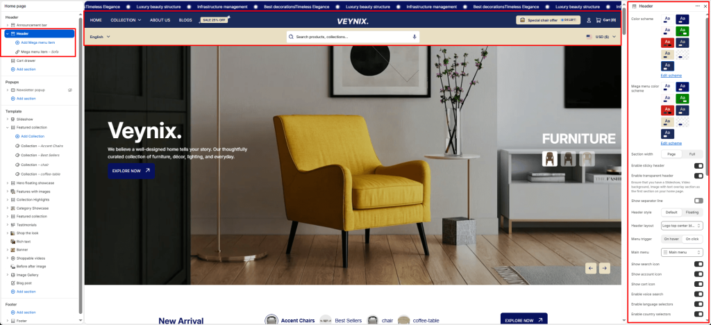
The Header section controls the global site header — logo, main navigation, search, cart icon, and account links — along with sticky-header behavior and mobile menu configuration.
Section Settings #
Color scheme #
Choose a predefined color scheme to control the section’s background, text, and accent colors, keeping it consistent with the rest of the theme design.
Mega menu color scheme #
Choose a color scheme to apply to this element, keeping it consistent with the rest of the theme design.
Floating header background color #
Choose a specific color for this element.
Floating header color #
Choose a specific color for this element.
Section width #
Control how wide the section appears on the page.
Options:
- Page
- Full
Enable sticky header #
Toggle this feature on or off.
Enable transparent header #
Toggle this feature on or off. Ensure that you have a Slideshow, Video background, Image with text overlay section as the first section on your home page.
Show separator line #
Toggle this feature on or off.
Header style #
Choose one of the available options from the dropdown.
Options:
- Default
- Floating
Header layout #
Choose the layout arrangement used to display this section’s content.
Options:
- Logo centered
- Logo left
- Logo top center (double-row)
- Logo top left (double-row)
- Drawer
Menu trigger #
Choose one of the available options from the dropdown.
Options:
- On hover
- On click
Main menu #
Select the navigation menu to display.
Show search icon #
Toggle this feature on or off.
Show account icon #
Toggle this feature on or off.
Show cart icon #
Toggle this feature on or off.
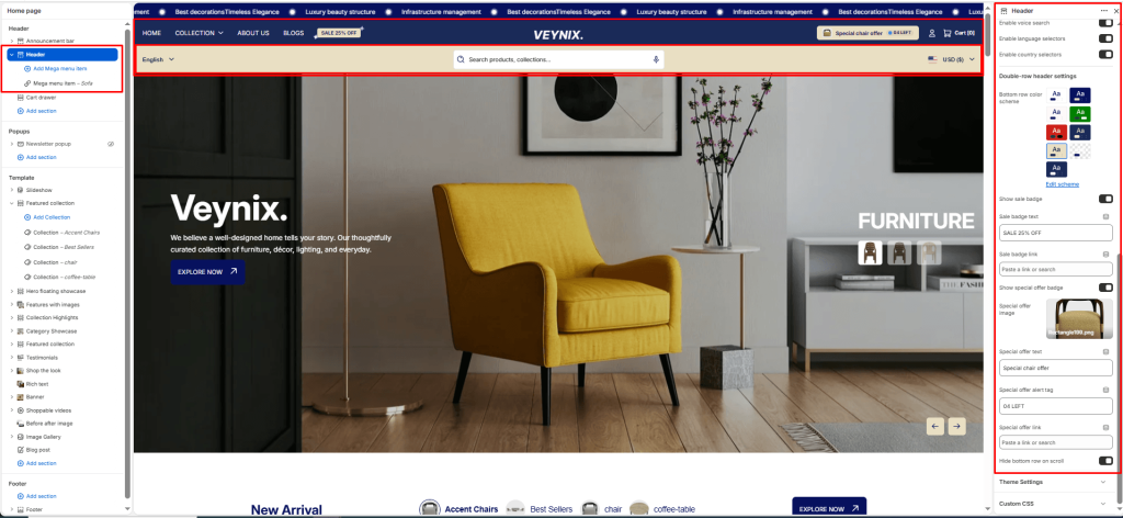
Enable voice search #
Toggle this feature on or off.
Enable language selectors #
Show a language selector dropdown in the announcement bar so customers can switch storefront language. Hidden automatically when full width marquee is enabled.
Enable country selectors #
Show a country/region selector dropdown in the announcement bar so customers can switch currency/market. Hidden automatically when full width marquee is enabled.
Bottom row color scheme #
Choose a color scheme to apply to this element, keeping it consistent with the rest of the theme design.
Show sale badge #
Configure how the badge is displayed for this element.
Sale badge text #
Configure how the badge is displayed for this element.
Sale badge link #
Configure how the badge is displayed for this element.
Show special offer badge #
Configure how the badge is displayed for this element.
Special offer image #
Configure how the badge is displayed for this element.
Special offer text #
Configure how the badge is displayed for this element.
Special offer alert tag #
Configure how the badge is displayed for this element.
Special offer link #
Configure how the badge is displayed for this element.
Hide bottom row on scroll #
Toggle this feature on or off.
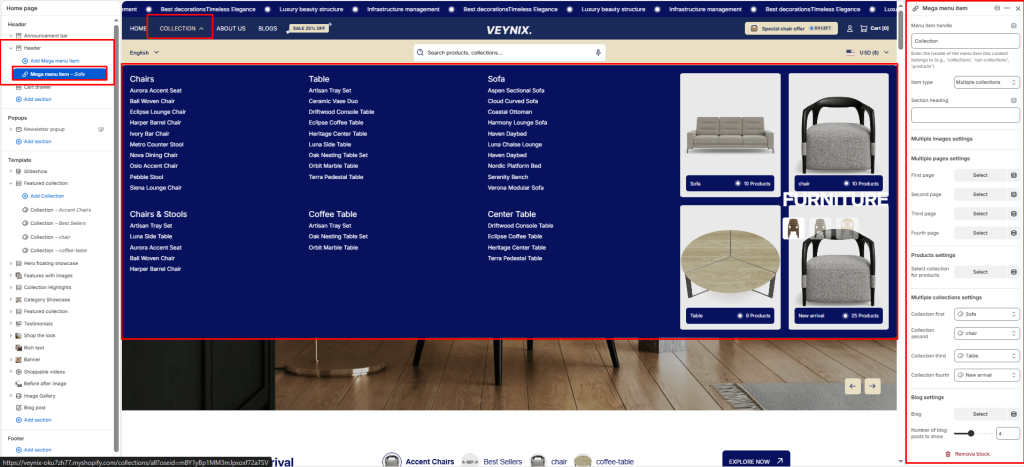
Section Blocks #
Mega menu item block #
- Menu item handle — Enter the text content to display.
- Item type — Choose one of the available options from the dropdown.
- Section heading — The main heading text for this section.
- First image — Upload an image to use for this element.
- First link — Set the destination link — this can point to a product, collection, page, blog article, or external URL.
- First text — Enter the text content to display.
- First link label — Enter the text content to display.
- Second image — Upload an image to use for this element.
- Second link — Set the destination link — this can point to a product, collection, page, blog article, or external URL.
- Second text — Enter the text content to display.
- Second link label — Enter the text content to display.
- Third image — Upload an image to use for this element.
- Third link — Set the destination link — this can point to a product, collection, page, blog article, or external URL.
- Third text — Enter the text content to display.
- Third link label — Enter the text content to display.
- Fourth image — Upload an image to use for this element.
- Fourth link — Set the destination link — this can point to a product, collection, page, blog article, or external URL.
- Fourth text — Enter the text content to display.
- Fourth link label — Enter the text content to display.
- First page — Select the page whose content should be displayed.
- Second page — Select the page whose content should be displayed.
- Third page — Select the page whose content should be displayed.
- Fourth page — Select the page whose content should be displayed.
- Select collection for products — Select the collection this section should pull products from.
- Number of products to show — Use the slider to fine-tune this value numerically.
- Collection first — Select the collection this section should pull products from.
- Collection second — Select the collection this section should pull products from.
- Collection third — Select the collection this section should pull products from.
- Collection fourth — Select the collection this section should pull products from.
- Blog — Select which blog this section should pull articles from.
- Number of blog posts to show — Use the slider to fine-tune this value numerically.


