Skip to content
Villyit
Villyit
  • Contact
  • Theme Support

getting Starting

1
  • Getting Started

general settings

12
  • Additional Features
  • Cart
  • Product
  • Search
  • Badges
  • Currency codes
  • Social Media
  • Layout
  • Typography
  • Colors
  • Breadcrumbs
  • Logo

header

3
  • Cart drawer
  • Header
  • Announcement bar

sections

34
  • Gallery
  • Logo List
  • Scrolling text
  • Testimonials
  • Image card
  • Video
  • Image Zigzag
  • Video Testimonials
  • Media grid
  • Highlight testimonial
  • Product bundle
  • Visual story
  • Highlight text with image
  • Steps
  • Slideshow
  • Shop the look
  • Rich Text
  • Our team
  • Newsletter
  • Multicolumn
  • Image with Text
  • Image gallery
  • Hero image
  • Hero floating showcase
  • Features with images
  • Featured Collection
  • FAQ
  • Contact Form
  • Collection highlights
  • client logo
  • Category showcase
  • Cart drawer
  • before after image
  • Banner

footer

1
  • Footer

blogs and articles

4
  • Related Post
  • Main Blog
  • Blog Post
  • Article

collections

4
  • Main Collection List
  • Main Collection Banner
  • Main Collection
  • Collection List

product

5
  • Related Products
  • Recently viewed products
  • Featured product
  • Product recommendations
  • Main Product

blocks

15
  • Blocks
  • Heading
  • Text
  • Subheading
  • Slide
  • Rich text
  • Rating
  • Product block
  • Buttons
  • Image
  • Group
  • Countdown
  • Column
  • Circular text badge
  • Breadcrumbs

Popups

1
  • Newsletter Popup
View Categories
  • Home
  • Helpdesk
  • Veynix
  • collections
  • Main Collection

Main Collection

1 min read

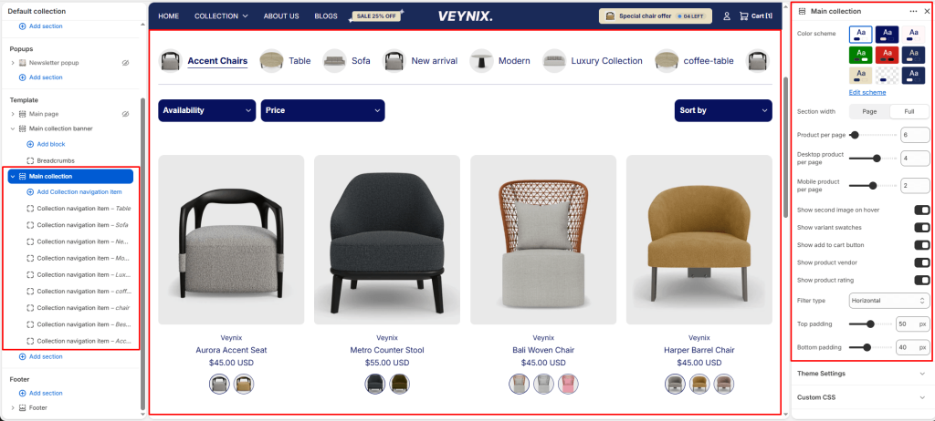
The Main Collection section renders the collection page’s product grid, including filtering, sorting, and pagination controls.

Section Settings #

Color scheme #

Choose a predefined color scheme to control the section’s background, text, and accent colors, keeping it consistent with the rest of the theme design.

Section width #

Control how wide the section appears on the page.

Options:

  • Page
  • Full

Product per page #

Use the slider to fine-tune this value numerically.

Desktop product per page #

Use the slider to fine-tune this value numerically.

Mobile product per page #

Use the slider to fine-tune this value numerically.

Show second image on hover #

Toggle this feature on or off.

Show variant swatches #

Toggle this feature on or off.

Show add to cart button #

Toggle this feature on or off.

Show product vendor #

Toggle this feature on or off.

Show product rating #

Toggle this feature on or off.

Filter type #

Choose one of the available options from the dropdown.

Options:

  • Vertical
  • Horizontal
  • Drawer

Top padding #

Add vertical spacing above the section content for better layout balance with the section above it.

Bottom padding #

Add vertical spacing below the section content for better layout balance with the section below it.

Section Blocks #

Collection navigation item block #

  • Collection — Select the collection this section should pull products from.
  • Image — Upload the image to display for this block/section.
  • Heading — Enter the text content to display.
Updated on July 3, 2026

What are your Feelings

  • Happy
  • Normal
  • Sad
Share This Article :
  • Facebook
  • X
  • LinkedIn
  • Pinterest
Table of Contents
  • Section Settings
    • Color scheme
    • Section width
    • Product per page
    • Desktop product per page
    • Mobile product per page
    • Show second image on hover
    • Show variant swatches
    • Show add to cart button
    • Show product vendor
    • Show product rating
    • Filter type
    • Top padding
    • Bottom padding
  • Section Blocks
    • Collection navigation item block
© 2025 Villyit . All Rights Reserved.