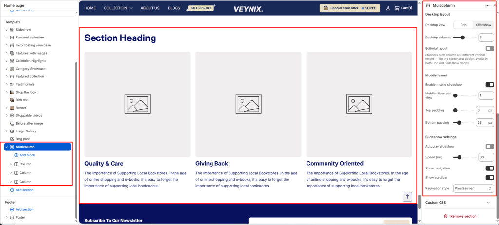
The Multicolumn section arranges a set of content blocks (icon/image + heading + text) side by side in evenly spaced columns — ideal for value propositions, service highlights, or feature summaries.
Section Settings #
Color scheme #
Choose a predefined color scheme to control the section’s background, text, and accent colors, keeping it consistent with the rest of the theme design.
Section width #
Control how wide the section appears on the page.
Options:
- Page
- Full
Subheading #
A short label or eyebrow text displayed above the main heading.
Subheading size #
Control the font size of the subheading.
Options:
- H1
- H2
- H3
- H4
- H5
- H6
Heading #
The main heading text for this section.
Heading size #
Control the font size of the heading.
Options:
- H1
- H2
- H3
- H4
- H5
- H6
Text align #
Control the horizontal text alignment of the section content.
Options:
- Left
- Center
- Right
Text #
The body/description text for this section.
Text size #
Control the font size of the body text.
Options:
- H1
- H2
- H3
- H4
- H5
- H6
Desktop view #
Choose one of the available options from the dropdown.
Options:
- Grid
- Slideshow
Desktop columns #
Set the number of columns used in this layout, per screen size.
Editorial layout #
Choose the layout arrangement used to display this section’s content. Staggers each column at a different vertical height — like the screenshot design. Works in both Grid and Slideshow modes.
Editorial offset #
Use the slider to fine-tune this value numerically. How far each column steps down from the previous one.
Editorial column gap #
Set the number of columns used in this layout, per screen size.
Enable mobile slideshow #
Toggle this feature on or off.
Mobile slides per view #
Use the slider to fine-tune this value numerically.
Top padding #
Add vertical spacing above the section content for better layout balance with the section above it.
Bottom padding #
Add vertical spacing below the section content for better layout balance with the section below it.
Autoplay slideshow #
Enable to automatically rotate through slides without requiring the customer to click.
Speed (ms) #
Control how many seconds each slide is shown before automatically advancing (only applies when autoplay is enabled).
Show navigation #
Control the visibility of navigation arrows/dots.
Show scrollbar #
Toggle this feature on or off.
Pagination style #
Choose one of the available options from the dropdown.
Options:
Circle progress
Dots
Progress bar
Numbers line
Available Block: Column #
Each column block contains the following options:
Image #
Upload an image to represent the column visually.
Ideal for product shots, icons, or feature illustrations.
Heading #
The title or label for the column content.
Text #
Add a short description or supporting information beneath the heading.
Link (optional) #
Add a button or make the image clickable by linking to another page, product, or collection.


