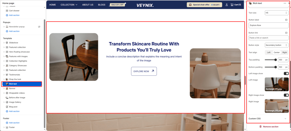
The Rich Text section is a simple, centered text block (subheading, heading, description, button) used for messaging that doesn’t need imagery — mission statements, section intros, or plain announcements.
Section Settings #
Color scheme #
Choose a predefined color scheme to control the section’s background, text, and accent colors, keeping it consistent with the rest of the theme design.
Section width #
Control how wide the section appears on the page.
Options:
- Page
- Full
Subheading #
A short label or eyebrow text displayed above the main heading.
Subheading size #
Control the font size of the subheading.
Options:
- H1
- H2
- H3
- H4
- H5
- H6
Heading #
The main heading text for this section.
Heading size #
Control the font size of the heading.
Options:
- H1
- H2
- H3
- H4
- H5
- H6
Text #
The body/description text for this section.
Text size #
Control the font size of the body text.
Options:
- H1
- H2
- H3
- H4
- H5
- H6
Button label #
The text displayed on the call-to-action button. Leave blank to hide the button.
Button link #
The page, product, collection, or URL the button links to.
Button style #
Choose the visual style of the button.
Options:
- Primary button
- Secondary button
Text align #
Control the horizontal text alignment of the section content.
Options:
- Left
- Center
- Right
Top padding #
Add vertical spacing above the section content for better layout balance with the section above it.
Bottom padding #
Add vertical spacing below the section content for better layout balance with the section below it.
Left image show #
Toggle this feature on or off.
Left image #
Upload an image to use for this element.
Right image show #
Toggle this feature on or off.
Right image #
Upload an image to use for this element.


