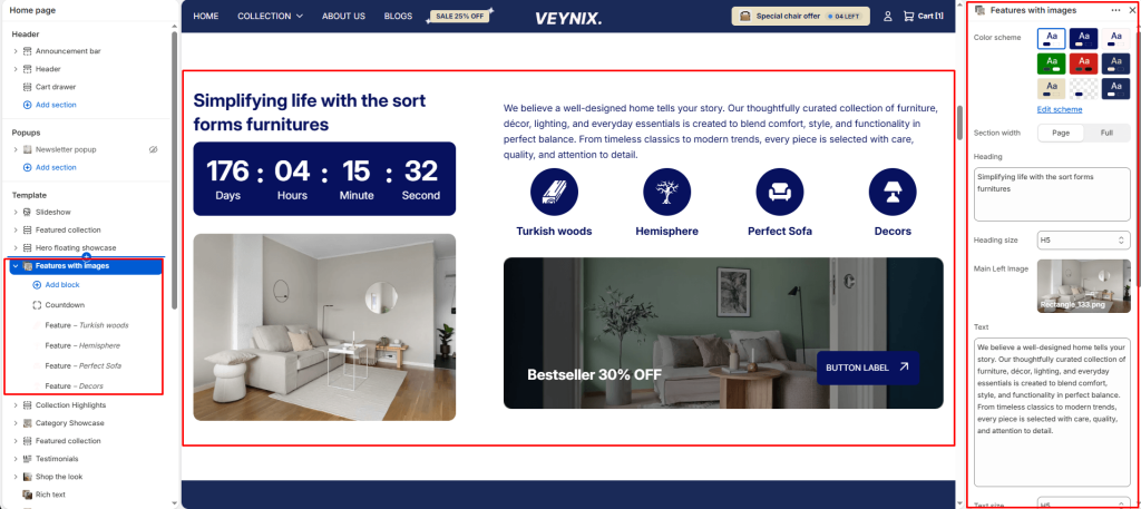
The Features with Images section presents a set of product or brand features, each paired with a supporting image, in an alternating zig-zag layout that keeps long-form content visually engaging.
Section Settings #
Color scheme #
Choose a predefined color scheme to control the section’s background, text, and accent colors, keeping it consistent with the rest of the theme design.
Section width #
Control how wide the section appears on the page.
Options:
- Page
- Full
Heading #
The main heading text for this section.
Heading size #
Control the font size of the heading.
Options:
- H1
- H2
- H3
- H4
- H5
- H6
Main Left Image #
Upload the image to display for this block/section.
Text #
The body/description text for this section.
Text size #
Control the font size of the body text.
Options:
- H1
- H2
- H3
- H4
- H5
- H6
Banner image #
Upload an image to use for this element.
Heading #
Enter the text content to display.
Link #
Set the destination link — this can point to a product, collection, page, blog article, or external URL.
Button label #
Enter the text content to display.
Button style #
Choose the visual style of the button.
Options:
- Primary button
- Secondary button
Top padding #
Add vertical spacing above the section content for better layout balance with the section above it.
Bottom padding #
Add vertical spacing below the section content for better layout balance with the section below it.
Section Blocks #
Feature block #
- Image — Upload the image to display for this block/section.
- Heading — Enter the text content to display.
- Link — Set the destination link — this can point to a product, collection, page, blog article, or external URL.
Countdown block #
- Color scheme — Choose a predefined color scheme to control the section’s background, text, and accent colors, keeping it consistent with the rest of the theme design.
- Expiration date — Enter the text content to display.
- Expiration behavior — Choose one of the available options from the dropdown.


