The Main Product section is the core product page layout — media gallery, title, price, variant selectors, quantity, add-to-cart, and product description.
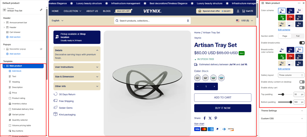
Section Settings #
Color scheme #
Choose a predefined color scheme to control the section’s background, text, and accent colors, keeping it consistent with the rest of the theme design.
Section width #
Control how wide the section appears on the page.
Options:
- Page
- Full
Enable breadcrumbs #
Toggle this feature on or off.
Breadcrumbs color scheme #
Choose a separate color scheme for the header/title area of this section, independent of the main content color scheme.
Gallery layout #
Choose the layout arrangement used to display this section’s content.
Options:
- Grid
- Thumbnails bottom
- Thumbnails left
- Slideshow
- Three column
Enable sticky content on desktop #
Toggle this feature on or off.
Enable sticky cart #
Toggle this feature on or off.
Top padding #
Add vertical spacing above the section content for better layout balance with the section above it.
Bottom padding #
Add vertical spacing below the section content for better layout balance with the section below it.
Section Blocks #
Text block #
- Text — The body/description text for this section.
Heading block #
No configurable settings — content is controlled by the block’s data source.
Price block #
No configurable settings — content is controlled by the block’s data source.
Quantity selector block #
No configurable settings — content is controlled by the block’s data source.
Description block #
No configurable settings — content is controlled by the block’s data source.
Volume pricing table block #
No configurable settings — content is controlled by the block’s data source.
Variant picker block #
No configurable settings — content is controlled by the block’s data source.
SKU block #
No configurable settings — content is controlled by the block’s data source.
Size chart block #
- Size chart page — Select the page whose content should be displayed.
Product rating block #
No configurable settings — content is controlled by the block’s data source.
Pickup availability block #
No configurable settings — content is controlled by the block’s data source.
Inventory status block #
- Low inventory threshold — Use the slider to fine-tune this value numerically.
- Show inventory count — Toggle this feature on or off.
Buy buttons block #
- Show dynamic checkout buttons — Toggle this feature on or off.
- Show recipient information form for gift cards — Toggle this feature on or off.
Complementary products block #
- Limit — Use the slider to fine-tune this value numerically.
- Heading — The main heading text for this section.
Trust badges block #
No configurable settings — content is controlled by the block’s data source.
Custom liquid block #
- Custom liquid — Enter raw Liquid/HTML/JavaScript code to render directly in this section.
Share block #
- Share label — Enter the text content to display.
Icon with text block #
- Icon with text layout — Choose the layout arrangement used to display this section’s content.
- Icon 1 — Choose the icon displayed for this element.
- Text 1 — Choose the icon displayed for this element.
- Icon 2 — Choose the icon displayed for this element.
- Text 2 — Choose the icon displayed for this element.
- Icon 3 — Choose the icon displayed for this element.
- Text 3 — Choose the icon displayed for this element.
- Icon 4 — Choose the icon displayed for this element.
- Text 4 — Choose the icon displayed for this element.
Accordion/tabs block #
- Color scheme — Choose a predefined color scheme to control the section’s background, text, and accent colors, keeping it consistent with the rest of the theme design.
- Layout type — Choose the layout arrangement used to display this section’s content.
- Default open item — Use the slider to fine-tune this value numerically.
- Heading 1 — Enter the text content to display.
- Content source for 1st item — Choose one of the available options from the dropdown.
- Custom content (for 1st item) — Enter formatted text content using the built-in rich text editor (bold, italics, links, lists).
- Heading 2 — Enter the text content to display.
- Content 2 — Enter formatted text content using the built-in rich text editor (bold, italics, links, lists).
- Heading 3 — Enter the text content to display.
- Content 3 — Enter formatted text content using the built-in rich text editor (bold, italics, links, lists).
- Heading 4 (rating) — Enter the text content to display.
- Content 4 — Enter formatted text content using the built-in rich text editor (bold, italics, links, lists).
Estimated delivery time block #
- Hide when pre-order is enabled — Toggle this feature on or off.
- Message — Enter formatted text content using the built-in rich text editor (bold, italics, links, lists).
- processing_days — Use the slider to fine-tune this value numerically.
- Minimum shipping days — Use the slider to fine-tune this value numerically.
- Maximum shipping days — Use the slider to fine-tune this value numerically.
- Skip weekends in calculation — Toggle this feature on or off.


