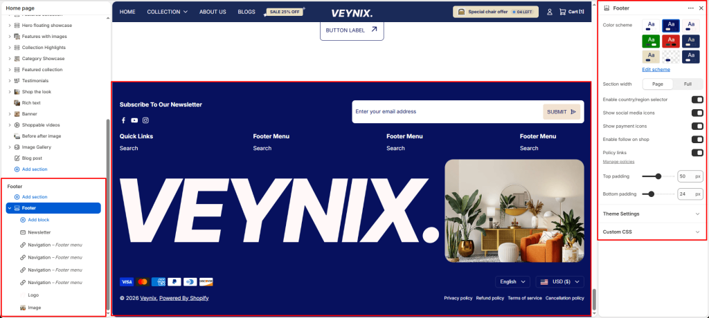
The Footer section controls the global footer that appears at the bottom of every page — including navigation menus, newsletter sign-up, social icons, payment icons, and copyright text.
Section Settings #
Color scheme #
Choose a predefined color scheme to control the section’s background, text, and accent colors, keeping it consistent with the rest of the theme design.
Section width #
Control how wide the section appears on the page.
Options:
- Page
- Full
Enable country/region selector #
Show a language selector dropdown in the announcement bar so customers can switch storefront language. Hidden automatically when full width marquee is enabled.
Show social media icons #
Choose the icon displayed for this element.
Show payment icons #
Choose the icon displayed for this element.
Enable follow on shop #
Toggle this feature on or off.
Policy links #
Toggle this feature on or off. Manage policies
Top padding #
Add vertical spacing above the section content for better layout balance with the section above it.
Bottom padding #
Add vertical spacing below the section content for better layout balance with the section below it.
Section Blocks #
Navigation block #
- Navigation — Select the navigation menu to display.
- Show navigation heading — Toggle this feature on or off.
- Navigation heading — Configures the “Navigation heading” option for this section.
Newsletter block #
- Newsletter heading — Configures the “Newsletter heading” option for this section.
- Newsletter text — Enter formatted text content using the built-in rich text editor (bold, italics, links, lists).
- Social link heading — Configures the “Social link heading” option for this section.
- Show social icon — Choose the icon displayed for this element.
Text block #
- Heading — The main heading text for this section.
- Logo — Upload an image to use for this element.
- Text — Enter formatted text content using the built-in rich text editor (bold, italics, links, lists).
- Text size — Control the font size of the body text.
- Show social icon — Choose the icon displayed for this element.
Image block #
- Image — Upload the image to display for this block/section.
Logo block #
- Logo — Upload an image to use for this element.
- Link — Set the destination link — this can point to a product, collection, page, blog article, or external URL.


