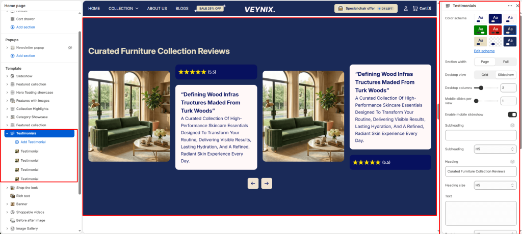
The Testimonials section displays customer reviews or quotes, often with star ratings and customer photos, to build social proof and trust.
Section Settings #
Color scheme #
Choose a predefined color scheme to control the section’s background, text, and accent colors, keeping it consistent with the rest of the theme design.
Section width #
Control how wide the section appears on the page.
Options:
- Page
- Full
Desktop view #
Choose one of the available options from the dropdown.
Options:
- Grid
- Slideshow
Desktop columns #
Set the number of columns used in this layout, per screen size.
Mobile slides per view #
Set the number of columns used in this layout, per screen size.
Enable mobile slideshow #
Toggle this feature on or off.
Subheading #
A short label or eyebrow text displayed above the main heading.
Subheading size #
Control the font size of the subheading.
Options:
- H1
- H2
- H3
- H4
- H5
- H6
Heading #
The main heading text for this section.
Heading size #
Control the font size of the heading.
Options:
- H1
- H2
- H3
- H4
- H5
- H6
Text #
The body/description text for this section.
Text size #
Control the font size of the body text.
Options:
- H1
- H2
- H3
- H4
- H5
- H6
Text align #
Control the horizontal text alignment of the section content.
Options:
- Left
- Center
- Right
Top padding #
Add vertical spacing above the section content for better layout balance with the section above it.
Bottom padding #
Add vertical spacing below the section content for better layout balance with the section below it.
Autoplay slideshow #
Enable to automatically rotate through slides without requiring the customer to click.
Speed (ms) #
Control how many seconds each slide is shown before automatically advancing (only applies when autoplay is enabled).
Show navigation #
Control the visibility of navigation arrows/dots.
Show scrollbar #
Toggle this feature on or off.
Pagination style #
Choose one of the available options from the dropdown.
Options:
- Dots
- Progress bar
- Numbers line
- Circle progress
Section Blocks #
Testimonial block #
- Card color scheme — Choose a color scheme to apply to this element, keeping it consistent with the rest of the theme design.
- Rating color scheme — Choose a color scheme to apply to this element, keeping it consistent with the rest of the theme design.
- Image — Upload the image to display for this block/section.
- Author image — Upload an image to use for this element.
- Author — Enter the text content to display.
- Author info — Enter the text content to display.
- Testimonial heading — Enter the text content to display.
- Text — Enter formatted text content using the built-in rich text editor (bold, italics, links, lists).
- Icons — Choose the icon displayed for this element.


