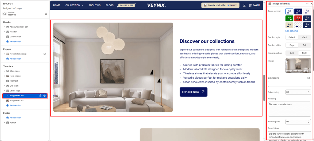
The Image with Text section pairs a single image with adjacent heading, body text, and button content in a two-column layout — a versatile building block for storytelling sections throughout the store.
Section Settings #
Color scheme #
Choose a predefined color scheme to control the section’s background, text, and accent colors, keeping it consistent with the rest of the theme design.
Inner color scheme #
Choose a color scheme to apply to this element, keeping it consistent with the rest of the theme design.
Section style #
Choose one of the available options from the dropdown.
Options:
- Default
- Card
Section width #
Control how wide the section appears on the page.
Options:
- Page
- Full
Image position #
Choose which side the image appears on relative to the text content.
Options:
- Left
- Right
Image #
Upload the image to display for this block/section.
Subheading #
Enter the text content to display.
Subheading size #
Control the font size of the subheading.
Options:
- H1
- H2
- H3
- H4
- H5
- H6
Heading #
The main heading text for this section.
Heading size #
Control the font size of the heading.
Options:
- H1
- H2
- H3
- H4
- H5
- H6
Description #
Enter the text content to display. Supports multiple lines.
Text size #
Control the font size of the body text.
Options:
- H1
- H2
- H3
- H4
- H5
- H6
Richtext #
Enter formatted text content using the built-in rich text editor (bold, italics, links, lists).
Text size #
Choose one of the available options from the dropdown.
Options:
- H1
- H2
- H3
- H4
- H5
- H6
Button label #
The text displayed on the call-to-action button. Leave blank to hide the button.
Button link #
The page, product, collection, or URL the button links to.
Button style #
Choose the visual style of the button.
Options:
- Primary button
- Secondary button
Enable small image #
Toggle this feature on or off.
Small image #
Upload an image to use for this element.
Top padding #
Add vertical spacing above the section content for better layout balance with the section above it.
Bottom padding #
Add vertical spacing below the section content for better layout balance with the section below it.


