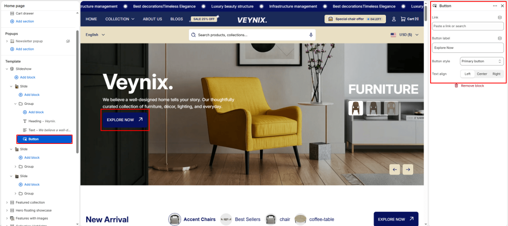
The Button block renders a call-to-action button/link with configurable label, destination, and visual style — reusable across nearly every section in the theme.
Settings:
- Link — Set the destination link — this can point to a product, collection, page, blog article, or external URL.
- Button label — Enter the text content to display.
- Button style — Choose one of the available options from the dropdown. Options: Primary button, Secondary button.
- Text align — Control the horizontal alignment of the text. Options: Left, Center, Right.


