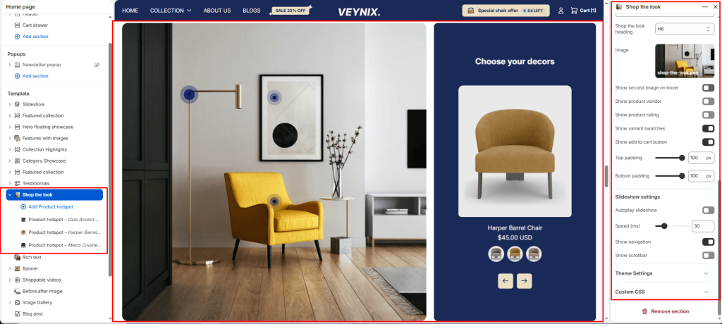
The Shop the Look section displays a lifestyle image with tappable hotspots pinned to specific products, letting customers shop an entire styled look directly from one photo.
Section Settings #
Color scheme #
Choose a predefined color scheme to control the section’s background, text, and accent colors, keeping it consistent with the rest of the theme design.
Products color scheme #
Choose a color scheme to apply to this element, keeping it consistent with the rest of the theme design.
Layout #
Choose the layout arrangement used to display this section’s content.
Options:
- Full width image
- Side by side
Section width #
Control how wide the section appears on the page.
Options:
- Page
- Full
Subheading #
A short label or eyebrow text displayed above the main heading.
Subheading size #
Control the font size of the subheading.
Options:
- H1
- H2
- H3
- H4
- H5
- H6
Heading #
The main heading text for this section.
Heading size #
Control the font size of the heading.
Options:
- H1
- H2
- H3
- H4
- H5
- H6
Description #
Enter formatted text content using the built-in rich text editor (bold, italics, links, lists).
Text size #
Control the font size of the body text.
Options:
- H1
- H2
- H3
- H4
- H5
- H6
Text align #
Control the horizontal text alignment of the section content.
Options:
- Left
- Center
- Right
Shop the look heading #
Enter the text content to display.
Shop the look heading size #
Choose one of the available options from the dropdown.
Options:
- H1
- H2
- H3
- H4
- H5
- H6
Image #
Upload the image to display for this block/section.
Show second image on hover #
Toggle this feature on or off.
Show product vendor #
Toggle this feature on or off.
Show product rating #
Toggle this feature on or off.
Show variant swatches #
Toggle this feature on or off.
Show add to cart button #
Toggle this feature on or off.
Top padding #
Add vertical spacing above the section content for better layout balance with the section above it.
Bottom padding #
Add vertical spacing below the section content for better layout balance with the section below it.
Autoplay slideshow #
Enable to automatically rotate through slides without requiring the customer to click.
Speed (ms) #
Control how many seconds each slide is shown before automatically advancing (only applies when autoplay is enabled).
Show navigation #
Control the visibility of navigation arrows/dots.
Show scrollbar #
Toggle this feature on or off.
Pagination style #
Choose one of the available options from the dropdown.
Options:
- Dots
- Progress bar
- Numbers line
- Circle progress
Section Blocks #
Product hotspot block #
- Product — Select the specific product to feature.
- Horizontal position — Use the slider to fine-tune this value numerically.
- Vertical position — Use the slider to fine-tune this value numerically.
- Horizontal position — Use the slider to fine-tune this value numerically.
- Vertical position — Use the slider to fine-tune this value numerically.


