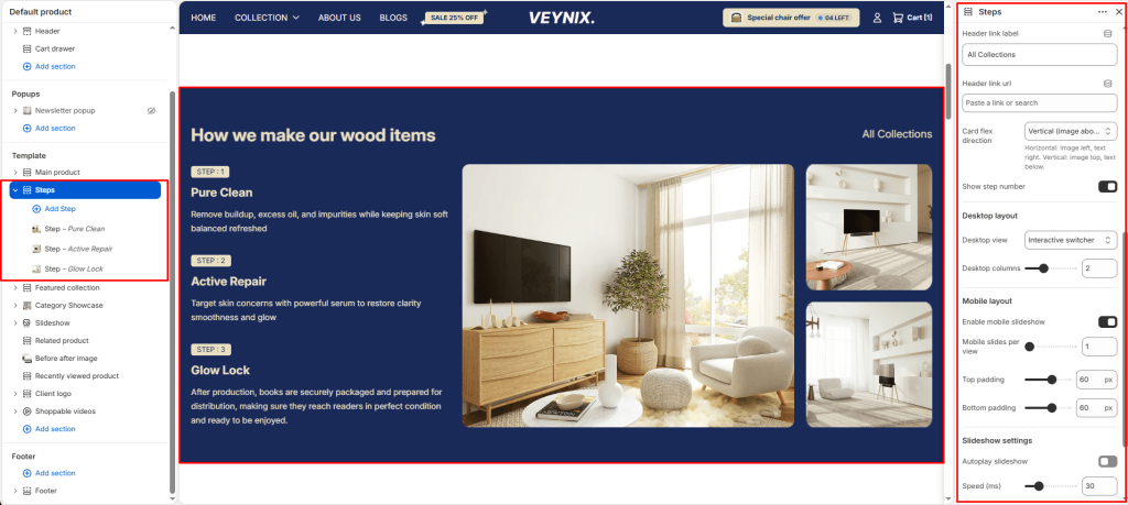
The Steps section presents a numbered, sequential process — such as “How it works” or “Order in 3 easy steps” — using icon/number + heading + text blocks.
Section Settings #
Color scheme #
Choose a predefined color scheme to control the section’s background, text, and accent colors, keeping it consistent with the rest of the theme design.
Section width #
Control how wide the section appears on the page.
Options:
- Page
- Full
Subheading #
A short label or eyebrow text displayed above the main heading.
Subheading size #
Control the font size of the subheading.
Options:
- H1
- H2
- H3
- H4
- H5
- H6
Heading #
The main heading text for this section.
Heading size #
Control the font size of the heading.
Options:
- H1
- H2
- H3
- H4
- H5
- H6
Text #
The body/description text for this section.
Text size #
Control the font size of the body text.
Options:
- H1
- H2
- H3
- H4
- H5
- H6
Text align #
Control the horizontal text alignment of the section content.
Options:
- Left
- Center
- Right
Header link label #
Enter the text content to display.
Header link url #
Set the destination link — this can point to a product, collection, page, blog article, or external URL.
Card flex direction #
Choose one of the available options from the dropdown. Horizontal: image left, text right. Vertical: image top, text below.
Options:
- Horizontal (image + text side by side)
- Vertical (image above text)
Show step number #
Toggle this feature on or off.
Desktop view #
Choose one of the available options from the dropdown.
Options:
- Grid
- Slideshow
- Interactive switcher
Desktop columns #
Set the number of columns used in this layout, per screen size.
Enable mobile slideshow #
Toggle this feature on or off.
Mobile slides per view #
Use the slider to fine-tune this value numerically.
Top padding #
Add vertical spacing above the section content for better layout balance with the section above it.
Bottom padding #
Add vertical spacing below the section content for better layout balance with the section below it.
Autoplay slideshow #
Enable to automatically rotate through slides without requiring the customer to click.
Speed (ms) #
Control how many seconds each slide is shown before automatically advancing (only applies when autoplay is enabled).
Show navigation #
Control the visibility of navigation arrows/dots.
Show scrollbar #
Toggle this feature on or off.
Pagination style #
Choose one of the available options from the dropdown.
Options:
- Dots
- Progress bar
- Numbers line
- Circle progress
Section Blocks #
Step block #
- Image — Upload the image to display for this block/section.
- Image width — Control how much horizontal space the image occupies relative to the text content.
- Step label (overrides auto number) — Enter the text content to display.
- Heading — Enter the text content to display.
- Text — The body/description text for this section.
- Button label — The text displayed on the call-to-action button. Leave blank to hide the button.
- Button link — The page, product, collection, or URL the button links to.
- Button style — Choose the visual style of the button.


