Skip to content
Villyit
Villyit
  • Contact
  • Theme Support

getting Starting

1
  • Getting Started

general settings

12
  • Additional Features
  • Cart
  • Product
  • Search
  • Badges
  • Currency codes
  • Social Media
  • Layout
  • Typography
  • Colors
  • Breadcrumbs
  • Logo

header

3
  • Cart drawer
  • Header
  • Announcement bar

sections

23
  • Video
  • Testimonials
  • Steps
  • Slideshow
  • Shop the look
  • Rich Text
  • Our team
  • Newsletter
  • Multicolumn
  • Image with Text
  • Image gallery
  • Hero image
  • Hero floating showcase
  • Features with images
  • Featured Collection
  • FAQ
  • Contact Form
  • Collection highlights
  • client logo
  • Category showcase
  • Cart drawer
  • before after image
  • Banner

footer

1
  • Footer

blogs and articles

4
  • Related Post
  • Main Blog
  • Blog Post
  • Article

collections

4
  • Main Collection List
  • Main Collection Banner
  • Main Collection
  • Collection List

product

5
  • Related Products
  • Recently viewed products
  • Featured product
  • Product recommendations
  • Main Product

blocks

15
  • Blocks
  • Heading
  • Text
  • Subheading
  • Slide
  • Rich text
  • Rating
  • Product block
  • Buttons
  • Image
  • Group
  • Countdown
  • Column
  • Circular text badge
  • Breadcrumbs

Popups

1
  • Newsletter Popup
View Categories
  • Home
  • Helpdesk
  • Veynix
  • sections
  • Category showcase

Category showcase

1 min read

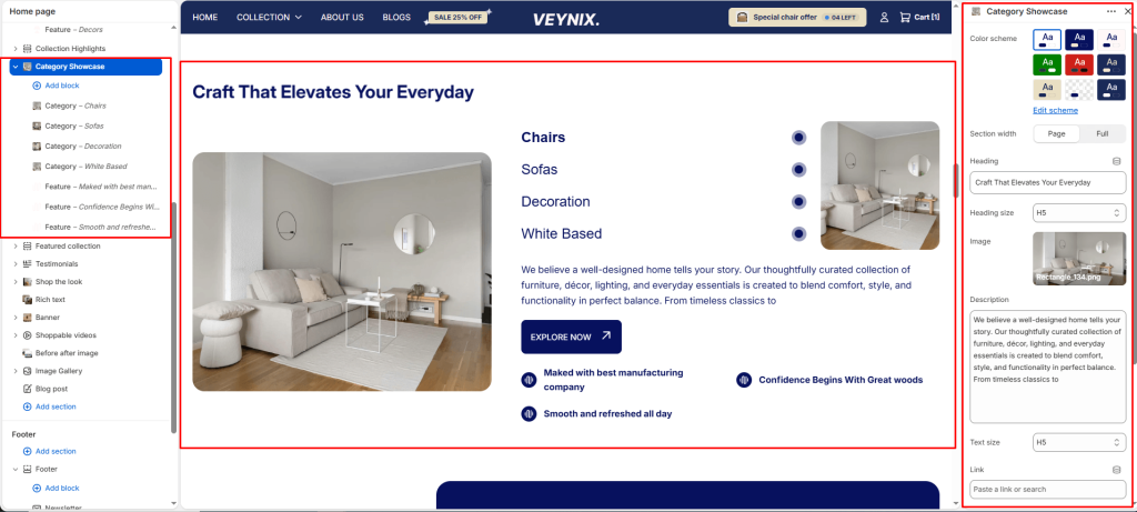
The Category Showcase section presents a curated set of product categories or collections in a structured grid, giving customers a fast visual path into the catalog straight from the homepage.

Section Settings #

Color scheme #

Choose a predefined color scheme to control the section’s background, text, and accent colors, keeping it consistent with the rest of the theme design.

Section width #

Control how wide the section appears on the page.

Options:

  • Page
  • Full

Heading #

The main heading text for this section.

Heading size #

Control the font size of the heading.

Options:

  • H1
  • H2
  • H3
  • H4
  • H5
  • H6

Image #

Upload the image to display for this block/section.

Description #

Enter the text content to display. Supports multiple lines.

Text size #

Control the font size of the body text.

Options:

  • H1
  • H2
  • H3
  • H4
  • H5
  • H6

Link #

Set the destination link — this can point to a product, collection, page, blog article, or external URL.

Button label #

Enter the text content to display.

Button style #

Choose the visual style of the button.

Options:

  • Primary button
  • Secondary button

Top padding #

Add vertical spacing above the section content for better layout balance with the section above it.

Bottom padding #

Add vertical spacing below the section content for better layout balance with the section below it.

Section Blocks #

Category block #

  • Category title — Enter the text content to display.
  • Category image — Upload the image to display for this block/section.
  • Category link — Set the destination link — this can point to a product, collection, page, blog article, or external URL.

Feature block #

  • Feature text — The body/description text for this section.
  • Custom icon (optional) — Choose the icon displayed for this element.
Updated on July 3, 2026

What are your Feelings

  • Happy
  • Normal
  • Sad
Share This Article :
  • Facebook
  • X
  • LinkedIn
  • Pinterest

Leave a Reply Cancel reply

Your email address will not be published. Required fields are marked *

Table of Contents
  • Section Settings
    • Color scheme
    • Section width
    • Heading
    • Heading size
    • Image
    • Description
    • Text size
    • Link
    • Button label
    • Button style
    • Top padding
    • Bottom padding
  • Section Blocks
    • Category block
    • Feature block
© 2025 Villyit . All Rights Reserved.