Skip to content
Villyit
Villyit
  • Contact
  • Theme Support

getting Starting

1
  • Getting Started

general settings

12
  • Additional Features
  • Cart
  • Product
  • Search
  • Badges
  • Currency codes
  • Social Media
  • Layout
  • Typography
  • Colors
  • Breadcrumbs
  • Logo

header

3
  • Cart drawer
  • Header
  • Announcement bar

sections

34
  • Gallery
  • Logo List
  • Scrolling text
  • Testimonials
  • Image card
  • Video
  • Image Zigzag
  • Video Testimonials
  • Media grid
  • Highlight testimonial
  • Product bundle
  • Visual story
  • Highlight text with image
  • Steps
  • Slideshow
  • Shop the look
  • Rich Text
  • Our team
  • Newsletter
  • Multicolumn
  • Image with Text
  • Image gallery
  • Hero image
  • Hero floating showcase
  • Features with images
  • Featured Collection
  • FAQ
  • Contact Form
  • Collection highlights
  • client logo
  • Category showcase
  • Cart drawer
  • before after image
  • Banner

footer

1
  • Footer

blogs and articles

4
  • Related Post
  • Main Blog
  • Blog Post
  • Article

collections

4
  • Main Collection List
  • Main Collection Banner
  • Main Collection
  • Collection List

product

5
  • Related Products
  • Recently viewed products
  • Featured product
  • Product recommendations
  • Main Product

blocks

15
  • Blocks
  • Heading
  • Text
  • Subheading
  • Slide
  • Rich text
  • Rating
  • Product block
  • Buttons
  • Image
  • Group
  • Countdown
  • Column
  • Circular text badge
  • Breadcrumbs

Popups

1
  • Newsletter Popup
View Categories
  • Home
  • Helpdesk
  • Veynix
  • sections
  • Image Zigzag

Image Zigzag

1 min read

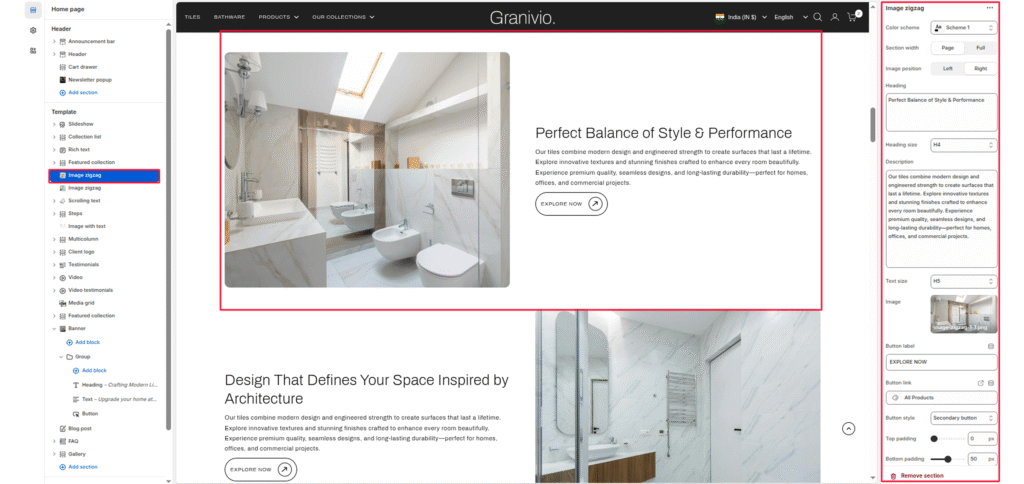
The Image Zigzag section is designed to showcase dual-column content with alternating text and images. It allows merchants to tell a story visually — pairing product imagery with descriptive text, headlines, and call-to-action buttons.

Color scheme #

Choose the theme color palette for this section.

Section width #

Choose how wide the section spans on the page:

  • Page: Keeps the content aligned with the main page container.
  • Full: Stretches the section across the full browser width.

Image #

Upload an image of the section. This image is typically used to represent product quality or key visual content.

Heading #

Add a heading to highlight the message related to the image.

Heading size #

Select the size of the heading (e.g., H1, H2, H3, H4, H5, H6).

Description #

Add descriptive text to explain more about the left-side image or content. Keep it concise and engaging.

Text size #

Control the size of the left-side body text (e.g., H1, H2, H3, H4, H5, H6).

Button label #

Enter the call-to-action text for the right-side button.

Button link #

Choose the link destination for the button (e.g., All Products collection or a custom URL).

Top padding #

Adjust the spacing above the section in pixels.

Bottom padding #

Adjust the spacing below the section in pixels.

Updated on July 3, 2026

What are your Feelings

  • Happy
  • Normal
  • Sad
Share This Article :
  • Facebook
  • X
  • LinkedIn
  • Pinterest
Table of Contents
  • Color scheme
  • Section width
  • Image
  • Heading
  • Heading size
  • Description
  • Text size
  • Button label
  • Button link
  • Top padding
  • Bottom padding
© 2025 Villyit . All Rights Reserved.