Skip to content
Villyit
Villyit
  • Contact
  • Theme Support

getting Starting

1
  • Getting Started

general settings

12
  • Additional Features
  • Cart
  • Product
  • Search
  • Badges
  • Currency codes
  • Social Media
  • Layout
  • Typography
  • Colors
  • Breadcrumbs
  • Logo

header

3
  • Cart drawer
  • Header
  • Announcement bar

sections

34
  • Gallery
  • Logo List
  • Scrolling text
  • Image card
  • Video
  • Image Zigzag
  • Video Testimonials
  • Media grid
  • Highlight testimonial
  • Product bundle
  • Visual story
  • Highlight text with image
  • Testimonials
  • Steps
  • Slideshow
  • Shop the look
  • Rich Text
  • Our team
  • Newsletter
  • Multicolumn
  • Image with Text
  • Image gallery
  • Hero image
  • Hero floating showcase
  • Features with images
  • Featured Collection
  • FAQ
  • Contact Form
  • Collection highlights
  • client logo
  • Category showcase
  • Cart drawer
  • before after image
  • Banner

footer

1
  • Footer

blogs and articles

4
  • Related Post
  • Main Blog
  • Blog Post
  • Article

collections

4
  • Main Collection List
  • Main Collection Banner
  • Main Collection
  • Collection List

product

5
  • Related Products
  • Recently viewed products
  • Featured product
  • Product recommendations
  • Main Product

blocks

15
  • Blocks
  • Heading
  • Text
  • Subheading
  • Slide
  • Rich text
  • Rating
  • Product block
  • Buttons
  • Image
  • Group
  • Countdown
  • Column
  • Circular text badge
  • Breadcrumbs

Popups

1
  • Newsletter Popup
View Categories
  • Home
  • Helpdesk
  • Veynix
  • sections
  • Gallery

Gallery

2 min read

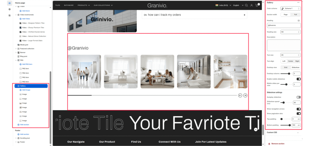
The gallery section is designed to showcase your brand’s social media presence directly on your store, helping to strengthen engagement and brand storytelling. This section displays a customizable grid or slider of images that mimic your Instagram posts, encouraging visitors to follow your brand and explore more content.

Section Settings #

Color scheme #

Select a predefined color palette to match your theme’s aesthetic.

Section Width #

  • Full: Stretches the section to the edges of the browser window.
  • Page: Constrains the content to the theme’s maximum site width.

Heading #

Add a section title (e.g.,@Granivio) to introduce your Instagram showcase.

Heading size #

Choose the appropriate heading tag (H1-H6) to fit your design hierarchy.

Description #

Optionally add a short text description to provide context or encourage visitors to follow your Instagram.

Text size #

Control the font size for the description text.

Text align #

Align your heading and description text to Left, Center, or Right.

Link #

Add your Instagram page link so visitors can easily access your profile.

Button label #

Define the button text (e.g., Instagram) displayed below the heading.

Layout settings #

Desktop view #

Choose between Grid or Slider layout for desktop devices.

Desktop columns #

Set the number of columns to display on desktop (commonly 3-5).

Enable mobile slider #

Toggle this option to activate a swipeable slider on mobile devices.

Mobile slides per view #

Set how many images should be visible per slide on mobile.

Slider Settings #

Enable desktop slider #

Enable or disable the slider functionality on the desktop view.

Slider speed (ms) #

Define the transition speed between slides (in milliseconds).

Show navigation #

Display arrow controls for easy manual navigation.

Show pagination #

Display small dots below the slider to indicate the current slide.

Top padding / Bottom padding #

Adjust vertical spacing above and below the section for consistent layout spacing.

Blocks Settings #

Each block represents an individual Instagram post image.

Image #

  • Upload or select an image to display within the feed.
  • You can add multiple image blocks to create a visually rich gallery.
Updated on July 3, 2026

What are your Feelings

  • Happy
  • Normal
  • Sad
Share This Article :
  • Facebook
  • X
  • LinkedIn
  • Pinterest
Table of Contents
  • Section Settings
    • Color scheme
    • Section Width
    • Heading
    • Heading size
    • Description
    • Text size
    • Text align
    • Link
    • Button label
  • Layout settings
    • Desktop view
    • Desktop columns
    • Enable mobile slider
    • Mobile slides per view
  • Slider Settings
    • Enable desktop slider
    • Slider speed (ms)
    • Show navigation
    • Show pagination
    • Top padding / Bottom padding
  • Blocks Settings
    • Image
© 2025 Villyit . All Rights Reserved.